The Insight page gives you an overview of the KPI values for the current week, their
statuses, and whether they are trending up or trending down.
By clicking
on a KPI tile you open that KPI details page, as shown below.
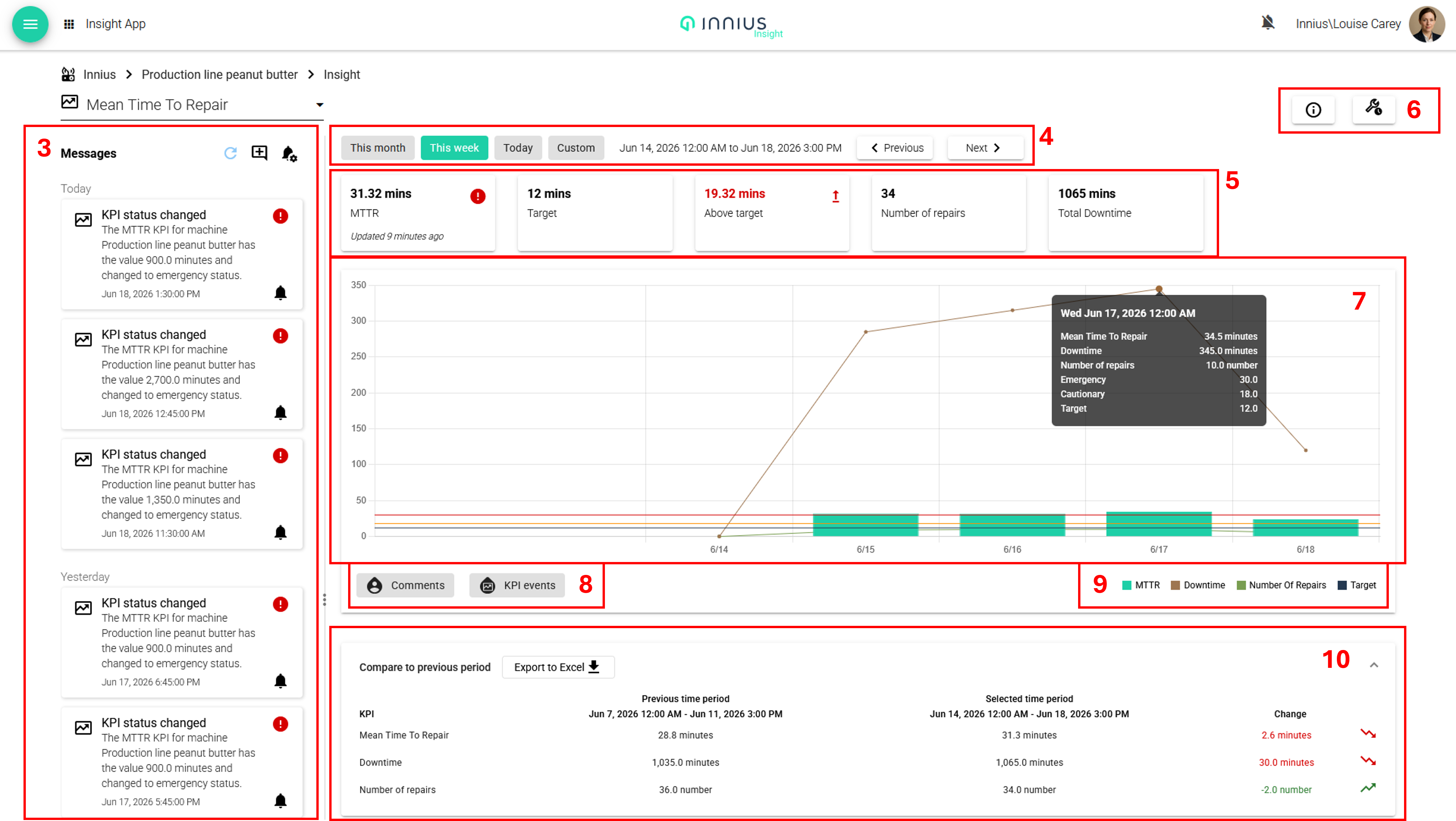
The KPI details pages follow a standard format, as follows:
(3) A timeline for that specific KPI, showing all KPI events, such as when thresholds have been crossed, and any user comments. It is possible to respond with your own comment to any other comments or machine events.
(4) Time period selection buttons, using either the preconfigured times, or a custom period. This selection then updates the data shown in the tiles, graph and the tables.
(5) Tiles which show the KPI value for the selected period, along with the target (as configured in the Admin app), the difference between the target and the actual value, and in the case of MTTR and MTBF, the numbers of repairs/failures and time to/between failures is also displayed.
Note: the target value is different from threshold values. Thresholds allow a value to be categorized as normal, cautionary or emergency and trigger notifications, whereas a target value is the desired value.
(6) In the top right, there is an information button which shows how the KPI has been configured. Next to it is a button which links through the to equivalent report for that KPI. (For EE and CU this is a print button)
(7) The graph itself is zoomable. Hoovering on a datapoint, will show a pop-up with the specific data for that point. If thresholds have been configured these will be shown on the graph and red (emergency) and orange (cautionary) lines. If a KPI crosses a certain threshold, you will be notified by a message on the timeline of the KPI and it's possible to receive a browser notification on desktop or device notification on mobile.
(8) Selecting the buttons 'Comments' and 'KPI events', overlay icons on the graphs at times when comments and events, as shown in the timeline (3) occurred. For some KPIs the button 'Overlay shifts' is also available, if shifts have been configured, and this overlays the graph with blocks of colour for each shift period.
(9) Below the graph, on the right, the legend is displayed, for the different lines and bars. These can be clicked on and off.
(10) The data table at the bottom of the page can be downloaded to Excel. For the KPIs OEE, CU and EE, it shows the shift data for the selected period. For MTTR and MTBF it shows the current data compared to the previous period.
In Grafana Dashboards
In Grafana dashboards you can
configure and view dashboards. Via dashboards you can present KPI data
in all kind of forms. An example of an OEE dashboard is given in the
picture below.